

Happy Tuesday dolls!
Feels so good to be back to blogging! 🙂
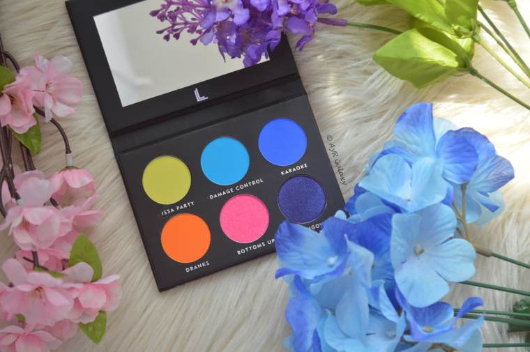
Today I’m FINALLY reviewing this palette that I received in my Boxycharm in August. Back then, Laura Lee was DEEP in controversy that even the apology video she made backfired completely. Absolutely NO ONE was happy to have gotten this palette, many giving it away or throwing it away. I however, decided to give it a shot and see if it was truly worth it.

Product Description from Laura Lee Los Angeles:
Wanna party? This highly pigmented palette is a must-have for every makeup enthusiast! This mini palette features 3 matte on-trend brights, and 3 shimmer shadows. These bold and versatile shades are formulated in a creamy easy blendable formula and designed in a travel friendly sized palette.
WHAT IT DOES
Designed to make you stand out, the Party Animal pressed pigment palette offers you a full range of on-trend shades that will keep your eyes looking bright! These highly pigmented pressed shades combine to make the perfect palette for any level makeup enthusiast.
Price: $19.00 USD
Packaging

The packaging is nice and small. I do love that this palette includes a mirror. Based on their description, they wanted to make a palette that really was “on-the-go”. The pan size looks generous but I’d have to depot the shadows to really see. I do also like the slight holographic design on the front, nice touch.
Formula & Application
Ok, here’s where things get tricky and annoying. Now, before you think I’m hating, I’m really not. I had high hopes for this palette, but it unfortunately let me down a bit.
I found that the formula was inconsistent, powdery, and not very blendable. Some shades turned out to be a bit dryer than others and not at all creamy as they claim, and some had far more kick back than I expected. I even experienced some lots of fallout in the shimmers which was a let down.
Since Laura Lee is a beauty guru, I kind of expected more from this palette. Obviously it’s the first product I’ve tried from her brand so I have nothing else to compare it to. But based on her experience with countless brands and trying different formulas, I figured she would have known what works and what doesn’t?
Shade Breakdown
As always, we’re taking it one shade at a time. And I’ll say this before I start, it COULD be a bad batch, I never discount that reason, but since we can’t know for sure, I have to judge the palette for how it performed based on MY experience.
* * *
ISSA PARTY
When I first opened the palette I got a little excited and thought this would be a bright bright yellow shade, but upon close inspection, it wasn’t? Which is weird because that’s exactly what it’s supposed to be? This shade is also the LEAST pigmented out of the six.
When swatched, I noticed it was a dull yellow, with slight green-ish undertones? Not at all what I expected. The green undertones aren’t THAT noticeable when swatched alone, but putting it up against my NYX Pressed Pigment in Hot Yellow, the difference is apparent.
Below is the side by side comparison and swatches for both:

Anyway, this shade feels a little creamy, it has little to no fallout and slight kick back.
* *
DAMAGE CONTROL
This shade is a matte bright sky blue. This was one of the shades that felt really chalky, powdery, and applied patchy. It did have some kick back, and it was also hard to blend. After some trial and error I found that this shade needs to be applied in a patting motion, and built up that way, and THEN blend out when you’re satisfied with the pigment. In my own opinion, that seems like too much work? These shades are supposed to be highly-pigmented after all, it shouldn’t have taken me that long to figure out how to make it work.
* *
KARAOKE
This shade is supposed to be a shimmer cobalt blue but it felt like a matte? I also didn’t see the shimmer at all. I thought it was a really pretty shade but it feels a bit powdery and dry. Unfortunately, I had the same problem with it as I did with Damage Control. It required I use the same strategy of applying it, packing it a ton to build up the pigment, and then blend it out. However, I also found that the more I blended, the more this shade faded? So that required extra work to build it up AGAIN.

DRANKS
This one is a matte bright orange. It was a shade that my eyes didn’t immediately gravitate towards. However, I feel like this shade out-performed the entire palette. In a sense, the shade I initially didn’t care for, performed wonderfully, and better than most.
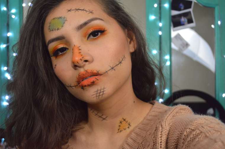
This one is by far the creamiest one out of them all. I used this shade for my Scare Crow look back in October for my Halloween Series, and I absolutely loved how pigmented and easily blendable this shade was. It was such an easy shade to work with, I literally had zero issues with this shade. Little to no kick-back and no fallout.
* *
BOTTOMS UP
Bottoms Up is a shimmer hot pink with sparkle. It feels chunky, and dry, and it has so much fallout and kick back. When applied, the sparkle is very scattered and it falls off the brush and it’s really hard trying to clean it up!
Also, this is yet another shade that needs to be build up a lot.. It’s best to apply it onto a wet base because it sticks and the pigment shows up well that way. Also, also, also, this shade stains the lid.
* *
HUNGOVER
Hungover is a deep violet with a beautiful slight icy-lavender shift. It swatches beautifully and it’s one of the shades I was looking forward to trying the most. But OMG, this shade let me down!! It’s weird, it feels velvety and creamy, but it’s incredibly powdery! It had tons of kick back, the fallout was insane, trying to clean it up was a mess even when removing it carefully.. AND… This shade does NOT blend well on top of Bottoms Up. I don’t know what it is, but I had an incredibly hard time trying to apply it right on top of the pink shade to no avail. It was nearly impossible, it doesn’t look like the shade is even there on the 4th look.
Anyway, this shade applies patchy as well, and it stains the skin HEAVILY!
Swatches
You guys know that swatches don’t mean shit if the shades themselves don’t perform well. These swatches are a perfect example of that. They obviously swatched beautifully, and they look super pigmented, but these were finger swatches and when applied with a brush, the majority were so hard to work with!

Last minute (meaning last night) I decided to do brush swatches (which I’ve never done here before). But I thought it was necessary to show you what I meant? Left side is with primer (wet base), right is without primer.

You can see right through the middle how the pigmentation changes without a primer and with a “wet” base. Obviously they’re more pigmented on a wet base, but they also apply patchy and it took me several strokes to make them look even remotely nice.
Pros & Cons:
Pros:
- Small and compact
- Size perfect for traveling
- Comes with a mirror
- Decently pigmented but needs LOTS of build up
- Vegan
- Cruelty-free
Cons:
- Inconsistent formula
- Some mattes dryer than others
- Kick back on a few shades (not really a huge deal)
- Some shades apply patchy
- A lot of fallout on some shades
- Takes some trial and error to make it work
- Not a great palette for beginners
Looks:
#1: Flirty Pink
I did my best to make it work the first time for my first impressions video and that’s when I realized the blues (as well as the palette in general) might not be as great as I initially thought it would be:

* *
#2: Scare Crow
I only used Dranks for this look, but I loved how it performed. I didn’t do anything special but as you can see this shade is highly-pigmented, and it blended beautifully.
* *
Look 3: Indigo Dreams
Despite how incredibly pigmented this look appears to be, know that it took me A LONG TIME to build up the shades to get it to this point. It also took a lot of careful work when using Hungover, but eventually I got the pigment I wanted. I didn’t bother doing the rest of my makeup because cleaning it under my eyes was kind of terrible too.

* *
#4: Pink Sunset
For the last look I decided to try something completely new to me. If you’re into makeup I’m sure you’re familiar with this method, as it’s being used by many makeup enthusiasts, and it’s steadily gaining momentum. The trick is to apply the shadow to a wet base, essentially that means not setting the primer. This is so the shadow will stick and look more pigmented. I did this for the first look with Bottoms Up.

I did this in hopes that applying these shades would be easier, but in the end, I still had to build them up. Dranks performed well here too, but the others I still had to dip some more. The one that gave me the most trouble was Hungover, which I tried to apply onto my lash line. It just DID NOT want to show up on top of Bottoms Up. You can’t even tell it’s there! Ugh!!

This one is my favorite look out of all of them, but man, this palette didn’t make it easy for me to create it. Also, I DID use ALL the colors in the palette for this look.
* *
While I do think the shades are decently pigmented, I feel like this palette loses points from me because I have to work to get that pigmentation. For a truly highly-pigmented formula, one shouldn’t have to build up the shades so much for the payoff if you get what I’m saying. Highly-pigmented shades SHOULD BE highly-pigmented from the start, not after building it up a ton.
I unfortunately can’t say enough good things about this palette and its formula, but I didn’t want to shy away from writing this review. I wanted to be honest and I also made sure to give this palette several chances even after the first flop. I hope you guys don’t think I’m intentionally being harsh. If this palette worked for anyone, I’d love to know because perhaps it was a bad batch.
Who has this palette? Did you like it?
Did you give it away? Or did it work for you?
Find me on social media:
Instagram | Twitter | YouTube | Pinterest
Disclosure: this review is a personal opinion and is honest. I do not receive compensation for my reviews. Product(s) was/were purchased by me, unless noted otherwise.

I love this review! You really covered all of the bases. I got this in BoxyCharm as well, and despite the controversy, I decided to keep it. I have her Nudie Patootie palette and even though I despise the name, I liked it overall. I expected similar results from this palette, but I had the same issues as you! There is a lot of kickback, they don’t blend very well together (which is something you need in a color palette), and the yellow is the worst excuse for a yellow I’ve come across. It’s more like a dusty green! I’ve managed to use it for a few looks with a bunch of build up, just like you, and I don’t entirely HATE it, but it most definitely could’ve been way better!
LikeLiked by 1 person
Thanks so much!! And yeah, I think the names on this palette are kind of awful too lol
I’m glad to know I wasn’t the only one who had issues with this palette. I love color palettes because there’s just so many looks one can come up with, but this was such a bad palette.
The yellow was lame, I expected more from this but I’m happier with my NYX pressed pigment, lol.
It definitely could have been better and I honestly expected it to BE better. Maybe she needs to work on the formula a bit more.
LikeLike
Interesting color choices they added to this palette. I have never tried it. Great review. xx
LikeLiked by 1 person
Surprisingly the shades do compliment each other despite looking like they don’t. So that was nice.
LikeLiked by 1 person
The looks you did are so creative! The palette only has six shades but they all look so different x
LikeLiked by 1 person
Awh thanks girl! Now that you mention it, you’re right, they’re so different from each other lol.
LikeLiked by 1 person
Even if the palette was disappointing, at least you gave it a shot and shared your experience! I agree, highly pigmented shades should be highly pigmented from the beginning, not after working to make it so. Thanks for sharing!! 🙂
LikeLiked by 1 person
Glad you agree! 🙂 I was starting to feel like I was maybe being too harsh, and given Laura’s recent scandal a few months back, I didn’t want to make it seem like I was trashing her when I really wasn’t trying to do that, you know? LOL. The palette is just not that good unfortunately..
Thanks for reading love! ❤
LikeLiked by 1 person
I think you did a good job making it clear that you weren’t trashing her or anything. Your opinion was clearly of the quality of the palette itself, and even then, you did a good job still pointing out what you liked and then *why* you didn’t like other things, which is important. So I think you did great! 🙂 It’s hard to write less-than-positive reviews.
LikeLiked by 1 person
Oh good lol. But yes, I try to be as thorough as I can. And yes, kind of hard to write it because you can’t really be biased lol.
LikeLiked by 1 person
It’s so sad that this palette didn’t work out! It sounds like the only good things about it was the design of the palette. But even if the size is perfect for travel and it’s got a mirror it means nothing if the shadows are bad quality. This isn’t a palette that I would ever consider taking travelling, the colours are too bold for travel friendly looks that don’t stand out!
I still like the looks you did with it, especially the Halloween Scarecrow!
LikeLiked by 1 person
I was actually kind of bummed, the swatches look amazing, and some of the shades I was really looking forward to playing with but oh well.. Yeah that confused me too, yes it’s small but unless you’re going to some kind of party, I doubt people would take this with them? I mean, even for parties people chose neutral shades over bold colors lol.
Thanks so much for reading Cleia! 🙂
LikeLiked by 1 person
It kind of reminds me of that PUR palette that swatched really nice but was such a disappointment 😦
Unless you’re a crazy well known makeup artist it’s not really a practical palette for travel :S
LikeLiked by 1 person
omg yeah lol! that palette was so bad!
LikeLiked by 1 person
Ooh i totally see the green tint in the yellow shade & how scary the pink & purple stained your lids! I wonder why they wouldn’t blend together either?!
I love how you did both finger swatches & brush swatches with & without primer, too! I can see the difference so much!
All of the looks you created turned out so beautifully but I get what you mean about having to work hard to get enough pigmentation. That shouldn’t be the case at all. Great review, as always, Rossy! ♡
LikeLiked by 1 person
That’s still baffles my mind lol. How could two shades that go together perfectly not blend into each other? Such a shame and huge disappointment lol.
Thank you! I have never done brush swatches because that can be kind of hard to do, but it was necessary for this palette. I felt like I needed to show proof and justify my dislike for it because I know a lot of people don’t like Laura and they are biased towards her makeup as well. I tried to be as objective as possible.
Thank you for reading!<3xx
LikeLiked by 1 person