

Heyy dolls!!
I got a lookbook for you today! I’m so excited to finally be posting a lookbook using the Violet Voss HG PRO Eyeshadow Palette because it’s been a LONG time coming! A little over six months to be exact!
I had loads of fun creating looks with this palette and I feel like I was a bit more creative when I got the hang of it. I will have the full in-depth palette review for you tomorrow, but right now, let’s see what I’ve come up with.

READ: Unboxing — December 2018 BoxyLuxe
#1: Brunch & Chill
I don’t remember what shades I used for this look, but looking at the photo I kind of took a guess. The only one I’m really not sure of, is the shade “Chill”, the shade on my eyelid. The rest I think are correct.

Shades Used: Thanks A Latte, Hashtag, Transition, Chill(?), Crystal, So Jelly
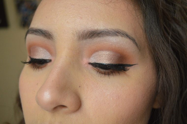
I had a hard time naming many of these, I don’t know why. Some names are very generic and are named after the shades used, I know, boring. But I called this Brunch & Chill because for some reason it reminds me of a look I’d wear for brunch. Is nice, simple, subtle, and natural.
* * *
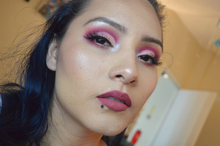
#2: Pink on Fleek
This is my least favorite look, and the reason why is because the cut crease didn’t come out quite as I envisioned. Even so, I like how the colors on my eyelid transition from lightest to “darkest”. The shimmers blended really well into themselves.
Shades Used: Thanks A Latte, Bestie, R U Kitten Me, Brownie Points, Teddy Bear, On Fleek, Cool Beans, So Jelly, Ploof

I named it Pink on Fleek because of the shade “On Fleek” and “So Jelly” which is a pinky shimmer. In reality, this look is hardly pink, but I really like how the shade “So Jelly” looks in the inner corner.
* * *
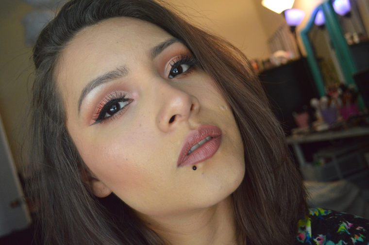
#3: Cranberry Wine
This was the first look I did on a wet base and I love how pigmented all the shades look, especially “Wine n Dine” which I wasn’t sure about because it took a bit to build up when swatched. However, it blended quite nicely and I kind of fell in love with this one.
Shades Used: Wine n Dine, Hashtag, Cranberry Splash, Crystal, So Jelly

Have you noticed I’ve been using “So Jelly” on the inner corner for all my looks so far?? I just love that shade too. I named this Cranberry Wine for the shades “Cranberry Splash” and “Wine n Dine”.. I know.. So NOT original! XD
* * *
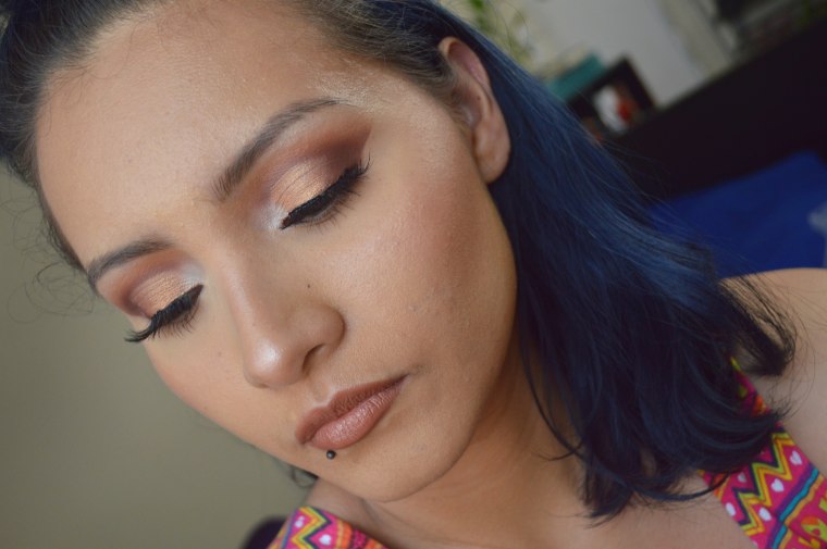
#4: Orange You Bronzed?
Since this palette is fairly neutral, I wanted to create a quickie look that didn’t require much time AND I also wanted something wearable for summer. Since I’m sooo obsessed with orange lipsticks, I couldn’t help but pair one up with this look. If I remember correctly, I’m wearing the ColourPop Ultra Matte Lip in What’s The Stitch.

Shades Used: Thanks A Latte, Hashtag, Brownie Points, Awesome Sauce, Crystal
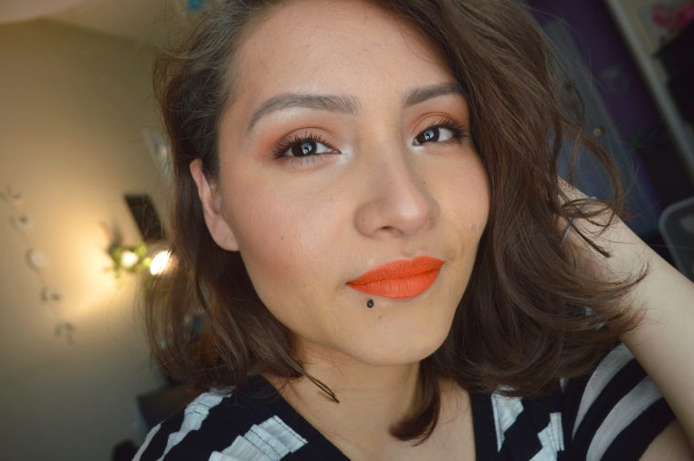
I came up with so many names for this look, it was hard to narrow it down. I feel like I just made a Dad Joke by picking Orange You Bronzed? but I’m hoping you guys get it LOL.
* * *
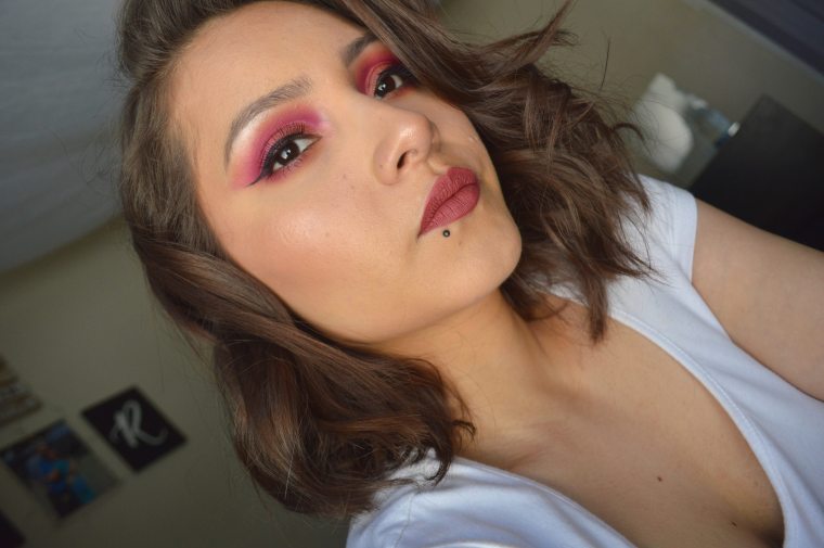
#5: Burgundy Splash
Another look on a wet base. Since I liked how Cranberry Wine came out, I wanted to play with the shade “Wine n Dine” again. I used a much lighter shade on the eyelid and I LOOOVE how it turned out. I was OBSESSED with this look and I think it might be my favorite out of them all. I couldn’t let this look go to waste, so I filmed my June Favorites and my Summer Try-On Haul.
READ: June 2019 Favorites
Shades Used: Wine n Dine, Teddy Bear, R U Kitten Me, So Jelly, Ploof, Crystal

I named it Burgundy Splash because I felt like that name fit this look better than Cranberry Wine? After all, “Wine n Dine” leans more towards a deep burgundy shade.
* * *
#6: Holy Grail
Ahh!! Another fantastic, favorite look! I love the shade I used in my eyelid, “Toffee”. It’s a gorgeous, metallic gold! I’m usually fussy when it comes to gold shades because they look coppery or bronze, but this one actually looks more yellow! It’s just gorgeous and so pigmented!!

Shades Used: Brownie Points, Hashtag, Transition, Toffee, Teddy Bear, Crystal
This look was the EASIEST to name. Some might say it’s after the palette itself, but that couldn’t be further from the truth! In actuality, I named it Holy Grail because the HG was believed to be a cup or platter used by Jesus in the Last Supper (no, I’m not religious). And since a cup can also be called a chalice, which is GOLD, it only made sense to name it that because of the shade “Toffee”. I mean, seriously! It’s one of my favorite gold shades!
That’s it you guys, “short”, sweet and to the point. I hope you guys like these looks and I hope that I demonstrated good range of looks that can be created with this palette.
Which look is your favorite??
And do you own this palette?
Find me on social media:

🙂 Those various styles of makeup look great on you!
Do enjoy the rest of your week!
LikeLiked by 1 person
Thank you very much! 🙂
You as well! Have an amazing weekend!
LikeLiked by 1 person
My favorite one is definitely Brunch and Chill. For some reason, whenever I do my makeup the colors just run together and don’t separate beautifully like yours. I truly loved all of the looks, but the first one is my favorite! 😊
LikeLiked by 1 person
Thank you so much!! 🙂 Brunch & Chill is one of my faves as well! 🙂 And it could be for many reasons, brushes are too cheap so I definitely recommend investing in some good quality ones. Maybe the formula of the shadows doesn’t blend well, some aren’t that good but some drugstore brands are stepping up and coming out with great quality shadows/palettes at an amazing price. And one thing to remember, blending is a process, lengthy at times, but totally worth it. Using different brushes will also help keep certain shades in one spot. 🙂
LikeLike
Wow, every look is amazing on you! I especially love Orange You Bronzed and Cranberry Wine – total stunners!
LikeLiked by 1 person
Awh thank you so much! I loved creating every single look. 🤗
LikeLiked by 1 person
Looks #1, #2, #3 and #5 are my favourite! How do people apply their eyeshadow so crisply and get the seamlessly blended effect?
LikeLiked by 1 person
Thank you so much!! My favorites are amongst those 😉
And blending takes a long long time and lots of patient. Sometimes it may even the brushes as well, if no you really want to get in there and be more detailed or precise, pencil brushes work really great for that or some pointy denser brushes.
LikeLiked by 1 person
All these looks are so pretty!! my favorite is the #4, love the orange lipstick!!!
LikeLiked by 1 person
Thank you!! I’m obsessed with orange lipsticks! I should have a post dedicated to orange shades possibly next week. xx
LikeLiked by 1 person
Wow, these look incredible and girl, you’re so talented to do all of these eye makeup looks! You look amazing and my fave is the cranberry wine 🙂 That palette shades are just gorgeous ❤️
LikeLiked by 1 person
Thank youu!! I agree this palette is amazing in terms of quality of formula and the shade range.
LikeLiked by 1 person
Such a lovely look hun. The colours are just so pretty. Cranberry wine is beautiful x
LikeLiked by 1 person
Thanks so much! 🙂 Everyone really seems to like that look LOL
LikeLiked by 1 person
Ahh it’s stunning x
LikeLiked by 1 person
Looove the Cranberry Splash look
LikeLiked by 1 person
Thank you! Everyone really seems to love that look the most 🙂
LikeLiked by 1 person
Oh my goodness, so many beautiful looks!! I love Cranberry Wine and Burgundy splash the most!! They are so pigmented and just absolutely stunning!! You’re so talented and skilled and makeup, Rossy!
LikeLiked by 1 person
Thank youuu!!! Everyone loves Cranberry Wine, idk why haha its always the looks I think people will like the least that are liked the most I wonder why that is haha maybe because they’re different and not neutral? People are tired of neutral looks by now huh? 🤣
LikeLiked by 1 person
I get that! I remember with our 10 x 10 challenge, the outfits I liked the least, everyone liked the most lol. Funny how it works like that! The cranberry wine look is just so bold and pigmented, it’s beautiful!! People love neutrals too but maybe people like the bold looks especially because a lot of us can’t do them ourselves but we can do neutrals lol. 😉
LikeLiked by 1 person
I am confused, are you talking about clothes or makeup? LOL either way, if you’ve tried it and it didn’t work for you, I do think that undertones does strongly influence whether something looks good on your or not, or rather, if certain colors look good on you. I wish I could have more colors in my closet, but I am not down with some colors, and it’s also hard to know for sure which will look ok or not. I need to go back to Pinterest and look up best colors for my undertones just in case
LikeLiked by 1 person
Both? Just saying regardless of what it is, sometimes you think other people will like something the least and they end up liking it a lot. 😉
LikeLiked by 1 person
Yes! Always happens to me lol
LikeLiked by 1 person
I love all of the looks that you came up with for this palette!
LikeLiked by 1 person
Thank you! 🙂 I’m getting a bit more creative LOL
LikeLiked by 1 person
Wow wow wow! I am stunned. All of these looks are absolutely gorgeous & SO perfect. Your cut creases keep getting better & your blending, too. I also love all the face makeup & lippies you chose for each look– they were all just the exact right match!
It is SO hard to pick a favorite but I’m gonna go with Burgundy Splash– it is just super bold & pretty!! ♡ For my second fave, I’d have to go with Orange You Bronzed? & hey, I’m allll for Dad Jokes. 🤣
The shade names in this palette are so fun! I was looking extra forward to this post & you did not disappoint. Totally worth the wait to see these creative & unique looks from you, Rossy!! ♡
LikeLiked by 1 person
Awh thanks! It makes me happy to hear that other people think I’m getting better too lol
I think burgundy splash is one of my faves too for the exact reason you mentioned.
Awh thanks for looking forward for this post! Hopefully my next lookbooks dont disappoint haha thanks Hunida! 💛🧡
LikeLiked by 1 person
Every time I think you can’t get better, you do! Just like with your bullet journal!
Yess, Burgundy Splash is killer, babe!!!
I can’t wait to see more lookbooks, I know they won’t disappoint. 😉 ❤
LikeLiked by 1 person
Thank youuu!!!! 🤗🤗
LikeLiked by 1 person