

Hello my dolls!
I love that I’m on a roll here with these palette reviews this week, but it just so happens that this one is my last one for the month, even though the month just started, lol. Since I wanted to do Halloween looks, I thought I could push my reviews until November, and that will also give me more time to gather my thoughts on products I’ve been using.
Anyway, today’s review is none other than Alamar’s Reina del Caribe eyeshadow palette. A lot of you are probably very familiar with this palette because I have been using it for weeks to create several looks. Now that all my pictorials are out there, it is time to review it!

Since Alamar is a new brand, I do want to tell you more about it.
About the brand:
Alamar Cosmetics was founded by Gaby Trujillo, a professional freelance makeup artist.
What is Alamar?
I was born in one of the many urban “barrios” in Cuba called, Alamar. I lived there for the first few years of my life before my family fled Cuba and moved to Miami, FL. Like all immigrants, I had to learn how to adapt to a new culture, learn a new language, and an entire new way of life.
The actual word Alamar means “stay close to the sea,” which to me meant to stay grounded to my culture. Upon learning this, suddenly the concept of my makeup brand became clear: through my brand, I want to inspire others to learn new things, adapt, change, evolve, but never forget that there’s beauty and inspiration in your very own roots.
Merge the new with the old, the modern with the classic, trends with the timeless, and you will find yourself.

Product Description from Alamar Cosmetics:
This palette features 8 highly opaque shades, reminiscent of the beauty and culture of Cuba. Dive into the pigments and pearls found in the intense metallics, or ground your look with the warm richness of the creamy mattes. For a more intense application, refer to the shade name that feature a water droplet, these shades can be used with a wet brush—the sun symbol represents the shades that should be used with a dry brush.
Made with love in the USA. Cruelty free. Gluten Free. Paraben Free. Mineral Oil Free.
Price & Size: $28.00 for 11.2g / 0.40 oz., $2.50 per gram
Packaging
I love the simple, bright yellow exterior with embossed bright orange letters. I have never seen a palette like this, I think it’s bold and unique in it’s packaging. It’s a standard cardboard palette with magnetic closure.

I love that it opens up like a book. The inside has a tropical theme and I feel like the packaging really compliments the color story. This palette does not include a mirror which I don’t mind because of the way the palette was set up. I also love that the shades are grouped separately according to their finish instead of mixed. The metallics do have a water droplet next to them which represents that they can be used with a wet brush for intense pigmentation.
Formula & Application
The formula is so so so goood! The metallics are high shine which is insane because when swatched dry, they’re incredibly pigmented but wet is when they really truly shine. The pigment is phenomenal!

The mattes are so good and creamy. There’s not a lot of kick back in Coco-taxi and Tropico but I did notice it in Guantanamera and Cafecito, both of which also felt a bit drier, but I don’t mind. Overall, the mattes blend well into each other and I had so much fun playing around with gradients with these specific shades.
Color Story & Shade Breakdown
So the color story is obvious, it’s a tropical theme inspired by Cuba. Both the design of the palette and the shades go well with the theme. Though at first glance I wasn’t sure about color combinations, the shades complimented each other so nicely, I didn’t have a hard time creating all kinds of different looks.
I want to break down this palette for you (like I always do), so let’s take it one shade at a time..
Shimmers/Metallics:
La Costa is a high shine shimmer, and is a pearly champagne with pink highlights. I personally loved using this shade as an inner corner and brow bone highlight because it was so gorgeous.
El Malecon is an extreme high shine metallic, and it is a true gold with rich olive undertones. I was getting tired of gold shades but this shade is so refreshing and unique with the olive undertones, and it’s so stunning on the eyes. I do feel as though it looks MUCH more olive-toned in the pan and on the swatches then it did on the eyes. I think maybe it was the way it caught the light, I don’t know, but I do want to play with it some more to figure it out.
Varadero is an extreme high shine metallic, and is a stunning deep royal blue/teal. I don’t often care for blue shades but this one blew my freaking mind. It’s so pigmented, so soft, not chunky, and it’s extremely high shine, it became one of my favorite shades. I had a fun time playing around with this one.
Celia is a high shine shimmer, and is a vivid turquoise with gold reflects. This is the one shade that I loved as soon as I swatched it. It’s incredibly beautiful and the gold reflects make it so unique. It applies beautifully and blends well into the other shimmery and metallic shades.

Velvet Mattes:
Coco-taxi is a yellow toned bright orange. I love this shade so much as a transition shade, it’s not too light whereas it wouldn’t show up on my skin tone, and I’m so happy about that. I could get away with using this shade for a subtle look or a simple wash of color.
Tropico is an intense burnt orange. I initially didn’t think I would like this shade as much, but as I used it more and more, I appreciated the fact that a shade like this was in the palette. It’s good if I want something more intense than Coco-taxi, and I love that you can also do a light wash with it or build it up to its full potential.
Guantanamera is a deep raspberry/burgundy. This is yet another shade that quickly became one of my favorites as well. However, I felt as though this shade applied a bit patchy and felt a little drier than the other mattes, but you can still build it up and it blends well with the other shades.
Cafecito is a deep coffee. I wasn’t sure if I would be able to use this shade properly but I managed and it turned out to be a great shade. It’s a deep shade but not too dark where you’d have trouble blending it out. I like this shade more when used with Tropico and/or Guantanamera.
Swatches
I’ve already described each shade in detail above, so it’s good to remember that swatches don’t always translate the same on the eyes. For this palette however, I felt like the swatches and the way they applied on the eyes was very accurate, with El Malecon as the only exception. Again, maybe it’s the way the shade catches the light and the gold ends up reflecting more than the olive tones, It’s very possible.

Pros & Cons:
Pros:
- SUPER pigmented
- High-quality eyeshadows
- Metallics do not feel chunky and apply easily
- Little to no fallout
- Metallics are AMAZING both dry and wet
- Shades blend well into each other — perfect for gradients
- Mattes compliment shimmers well
- Shimmers/metallics compliment each other well
- Gluten, paraben and mineral oil free.
- Made in the USA
- Cruelty Free
Cons:
- Some kickback in two shades (Guantanamera, Cafecito)
- Guantanamera felt a bit drier and applied patchy (can be fixed by building it up)
Makeup Looks:
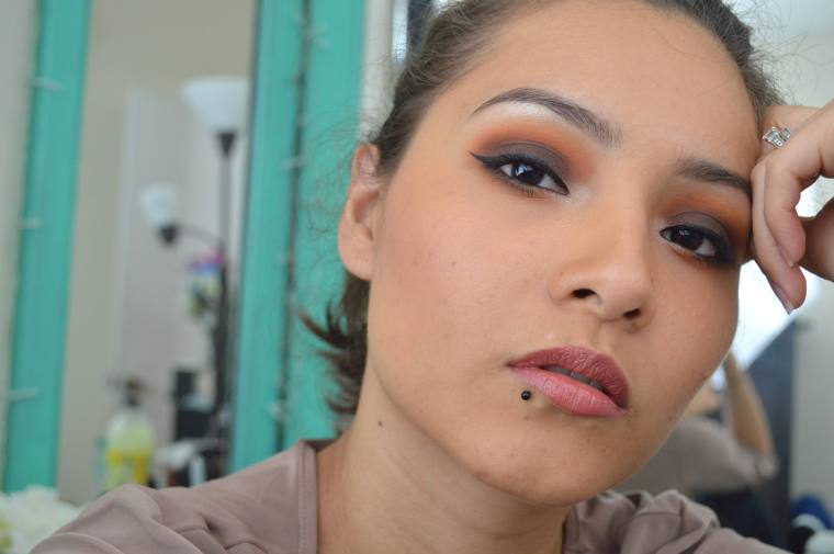
Look #1: Celia
I created this look when I did my first impressions post + video because it was the shade I was drawn to the most. Not my best blending and/or look and the photo quality sucks but you get the point..

* * *
Look #2: Sunset on the Water
Full Pictorial, here.
Since I didn’t know what to do with Varadero at first, I decided to use it as an eyeliner to test out it’s potential and to do a little experiment with color since it had been a while for me. Colored eyeliners never fail to make a look a bit extraordinary.

* * *
Look #3: Tropical Beach
Full Pictorial, here.
This was the first gradient look with this palette, and I loved how it turned out. This made me want to play and experiment more with gradients. It still stands as one of my favorite looks using this palette.

* * *
Look #4: Olive Gold Cut-Crease
Full Pictorial, here.
This is my least favorite look and I’ll tell you why. Firstly, I still have work to do on those cut-creases. Secondly, as I mentioned above in the shade breakdown, the shade of focus in this look is El Malecon, BUT I felt as though the shade didn’t look the same on the eyes as it did in the pan and in swatches. On the eyes I feel like it lacked those olive tones and I wish they would have stood out more.

* * *
Look #5: Horizon
Full Pictorial, here.
This was one of those looks that I wasn’t sure what the result would be. I just knew I needed to play with shades that I had barely touched. As it turns out, Cafecito complimented La Costa’s pink highlights quite well.

* * *
Look #6: Mar
Full Pictorial, here.
I wanted to play with color once more and I couldn’t make up my mind between Varadero or Celia so I ended up using both. It turned out to be another gradient look which I loved and it was my favorite one to name as well.

* * *
Look #7: Autumn Foliage
Full Pictorial, here.
Upon swatching Guantanamera and Cafecito, I knew immediately that these would be perfect fall shades and they delivered! Technically, I didn’t use Guantanamera for this look, but I will soon! 😉 It was such a simple look to create and I love that it didn’t take much effort to blend the shades together. You guys also loved it very much so tysm!
Overall Thoughts
This is probably one of my favorite palettes this year. I very much enjoyed playing with it and it sparked creativity in a way that no other palette has before.
I initially didn’t think the shades would compliment each other BUT they DO! Each and every one of them! The color story was well-thought out and I appreciate that they put so much effort into the quality for being their very first makeup product.

Though the price per gram is up there with other high-end brands (at $2.50 per gram) I do think that this palette is worth the $28. Realistically, for being a new indie brand, and a first product launch, the quality alone would be worth so much more. I’m glad that Gaby decided to keep this palette as affordable as possible for her customers without compromising quality.
This is by far one of my favorite color palettes and I would love to keep playing with it to create more looks. So I hope you guys don’t mind seeing it again just in case I do use it..
Who else owns this palette? Did you like it?
What’s your favorite shade and/or look?
Find me on social media:
Instagram | Twitter | YouTube | Pinterest
Disclosure: this review is a personal opinion and is honest. I do not receive compensation for my reviews. Product(s) was/were purchased by me, unless noted otherwise.

I love the second and seventh look a lot!!! and the palette looks so pretty, I love the shades and the summery vibe!!
LikeLiked by 1 person
Thanks so much! It really is gorgeous and it does have summer vibes 😁 I also love that the matte shades can be used for transitional looks from summer to fall 😊 I’m going to play around with it a bit more ☺
LikeLiked by 1 person
I loved all of your looks with this palette! And your review is so colourful with all the different heading colours, visually it’s really nice to read 🙂
I keep meaning to pull this palette out again and play with it, I tried out your Autumn foliage look the other day and I really liked it! (I didn’t take any photos or anything). Great post!
LikeLiked by 1 person
No one has ever commented on that so thank you lol.
Well I’m glad you liked the look! 😊
LikeLiked by 1 person
This palette is SO fun! I love the packaging. And is there a color out there that doesnnnn’t look good on you?!
LikeLiked by 1 person
Isn’t it?! 😀 and idk? I’m sure there is lol
LikeLiked by 1 person
Gorgeous, gorgeous love the Autumn, Celia and Horizon. xx 💋
LikeLiked by 1 person
Thank you so much!! 😊😊
LikeLike
I love how you put this post together! So detailed with all the right info but not too much & your writing is always so easy to read. ♡ I didn’t know the palette was only $28, what a steal!!
My favorite shade is Guatanamera & my fave looks are #2 & #5! 😄
LikeLiked by 1 person
Thanks so much! I think my writing has improved over the years and it also helped that I took a college level writing class in my senior year in HS and then again in college lmao. I do struggle putting together some sentences sometimes, English is so hard 😂
I know right?! $28 for a palette like this is mind blowing. I thought it would have cost more.
Guantanamera is growing on me,.then again I’ve always loved burgundy shades which I don’t have enough of.
Thanks for reading girl!!
LikeLiked by 1 person
Oh that’s awesome! I’ve never taken a writing class except for you know, the required ones in High School haha. 😛 I think your English is perfect!! ❤
Yeah $28 isn't bad at all!! I hope you can figure out a little look with the Guantanamera shade. 🙂
LikeLiked by 1 person
Lol thanks so much girl! 💜
LikeLiked by 1 person
I love every single look you created with this pretty palette. It’s obvious it sparked your creativity!
LikeLiked by 1 person
Thanks so much! And it really did. I have no idea what to do with my other simple palettes haha.
LikeLiked by 1 person
What a gorgeous palette! I love how bright and pigmented the eyeshadows are. I am curious, how do you apply eyeshadow wet instead of dry? I’ve heard that a few times but I have no idea how it could be done with powder eyeshadow! Also, I love how you wrote this post. It was so detailed and the descriptions were beautifully, vividly, written. ❤
LikeLiked by 1 person
I know!!! GORGEOUS! Fave palette this year lol. And you just get your brush wet, lightly of course, OR you could also use a wet finger, it works well both ways 🙂 I usually use setting spray for that but regular water works just fine. However, not every shimmery eyeshadow can be applied wet so you’ll have to see the directions for each palette because you can’t do it with any.
awh thanks so much! 🙂 beauty reviews are some of my favorite posts to write up lol
LikeLiked by 1 person
Thank you!! My new palette said that some could be applied wet so I was wondering what that meant haha. I definitely want to try it now!
LikeLiked by 1 person
Oh yay definitely try it and see how you like it!
LikeLiked by 1 person